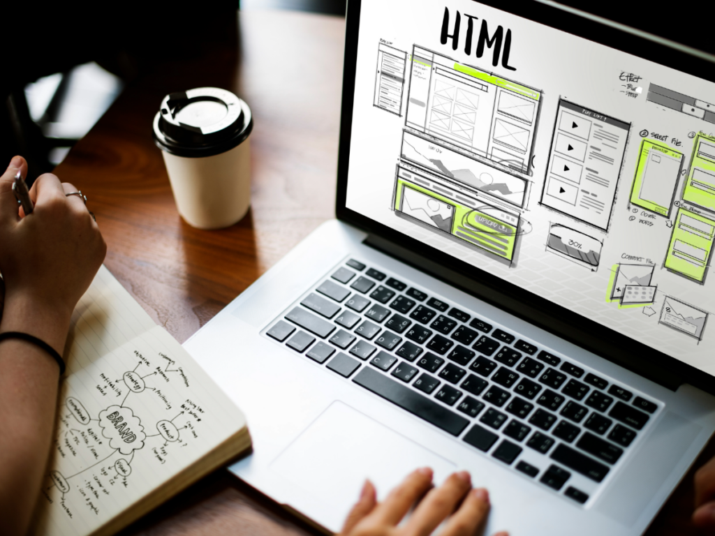
Your website starts speaking before anyone reads a headline, clicks a button, or fills out a form.
The layout, colors, typography, images, spacing, and page speed all send a message. Sometimes that message is clear and confident, and sometimes it’s messy and inconsistent. But oftentimes, without meaning to, your design makes people question whether they’re in the right place at all.
That’s why website design isn’t just about making a page look polished. It’s about helping people trust you sooner, clearly understand what you offer, and take the next step with less hesitation.
Design shapes first impressions, but it also shapes decisions. If your site feels (or simply is) outdated, hard to navigate, or disconnected from the rest of your brand, visitors may leave before they ever understand how strong your product, service, or team really is.
Good design doesn’t decorate a weak message; It makes the right message easier to believe.
Trust Starts with Clarity
Trust starts when people can quickly understand who you are, what you do, and what they should do next.
That sounds simple, but it’s where many fall apart. Businesses often try to fit too much onto one page because every service, feature, audience, and proof point feels important. But when everything competes for attention, nothing feels clear.
Clear design gives people a path.
That includes:
- Simple navigation that uses language people actually understand
- Page layouts that follow a logical flow
- Headlines that make the offer obvious
- Calls to action that are easy to find
- Enough white space to let the page breathe
- Content that supports the decision instead of overwhelming it
Nielsen Norman Group’s guidance on trustworthy web design points to design quality, upfront disclosure, current content, and connection to the rest of the web as credibility factors. People don’t just judge your site by how nice it looks. They judge whether it feels organized, transparent, useful, and legitimate.
Clarity doesn’t mean your design has to be plain. It means every visual choice should make the experience easier to understand.
Consistency Makes Your Brand Feel More Credible
Your brand identity doesn’t live in a logo file. (And if it does, that’s ok, but let’s talk.) It shows up everywhere your audience interacts with you.
Your brand identity is your website, landing pages, ads, email newsletters, social posts, sales collateral, and even the way your buttons look from one page to the next. When those elements are aligned, your business is not just established, but a brand.
That’s the real value of strong visual branding. It gives your audience repeated signals that they’re dealing with the same company, the same quality, and the same promise every time.
Consistency includes:
- Logo usage (and how not to)
- Color palette (primary and secondary)
- Typography
- Button styles
- Icon styles
- Photography and illustration direction
- Social graphics
- Landing page and newsletter layouts
- Ad creative
- Website and campaign alignment
A strong brand identity design system helps prevent those gaps. It gives your team a shared foundation so every channel feels connected, even when different people are creating different pieces of content.
Consistency doesn’t mean every asset should look exactly the same. It means everything should feel like it belongs to the same brand.
Visual Hierarchy Guides People Toward Action
People don’t read websites from top to bottom with perfect attention. They scan, pause, skim, and look for cues that tell them what matters. Half the time, they don’t even make it below the fold.
That’s where visual hierarchy comes in.
Visual hierarchy in UX helps guide attention by using size, contrast, spacing, grouping, and placement. It tells people what to notice first, what to read next, and where to go when they’re ready to act.
Strong hierarchy can show up through:
- A clear H1 that anchors the page
- Supporting subheads that break down the message
- CTA buttons that stand out without feeling aggressive
- Short sections that are easy to scan
- Visuals that reinforce the content
- White space that separates ideas
- Testimonials or proof points placed near decision moments
When hierarchy is weak, users have to work harder. They may miss the most important CTA, skim past a key benefit, or leave because the page feels too busy.
Conversion-focused web design should reduce that effort. It should make the next step feel obvious and simple without pushing the visitor.
That’s especially important for landing pages tied to campaigns. If someone clicks an ad for a specific offer and lands on a page with too many competing messages, the design is working against the campaign. But if the page reinforces the same promise, keeps the flow focused, and makes the CTA easy to find, the design supports the conversion.
Design and Copy Have to Work Together
But design alone doesn’t cut it. A beautiful website with unclear messaging still creates confusion.
Design can make a page feel polished, but copy gives it meaning. And while copy can make a strong argument, design determines whether and how people absorb it. The two have to work together.
If your copy explains the value of your offer, the design should make that value easy to see. If your design highlights a CTA, the copy should make the action worth taking. If your page is meant to build trust, your visuals, proof points, and language should all reinforce that trust at the same time.
Design and content marketing shouldn’t be treated as separate lanes that meet at the very end. The best web experiences are built when messaging and visuals are developed together.
For example, a homepage shouldn’t just look impressive. It should quickly answer:
- What do you do?
- Who do you help?
- Why should someone trust you?
- What makes you different?
- What should someone do next?
Design gives those answers structure. Copy gives them substance. When aligned, the page feels easier to navigate, easier to believe, and easier to act on.
Conversion-Focused Design Isn’t Pushy
Conversion doesn’t have to mean loud buttons, aggressive pop-ups, countdown timers, or five CTAs before someone understands the offer.
In fact, those choices can hurt trust when they’re used without intention.
Conversion-focused design is really about reducing friction. It helps people feel informed, comfortable, and confident enough to take the next step.
That can include:
- Clear offers
- Simple contact forms
- Fast page load times
- Mobile-friendly layouts
- Testimonials and reviews
- Case studies
- Easy access to contact information
- CTAs that match the user’s stage of intent
Website performance matters here, too. Slow pages, shifting layouts, and frustrating mobile experiences can make even the best design feel broken. Google’s Core Web Vitals measure real-world user experience factors like loading performance, interactivity, and visual stability. And web.dev’s Core Web Vitals make it clear that a healthy site experience is both a usability issue and a performance issue.
That’s why effective website design and development has to consider the full experience, not just how the page looks in a mockup.
Signs Your Design May Be Costing You Leads
Not every design issue is obvious at first glance. Sometimes the site still looks “fine,” but the experience is quietly working against your growth.
Here are a few signs your design may be creating friction:
- Your site looks outdated compared to your current positioning.
- Your CTAs are hard to find or feel inconsistent from page to page.
- Your navigation makes users guess where to go.
- Your pages are slow, crowded, or confusing.
- Your mobile experience feels like an afterthought.
- Your visuals don’t match the quality of your work.
- Your brand looks different across your website, ads, and social channels.
- Your landing pages don’t align with your paid campaigns.
- Your contact forms ask for too much too soon.
- Your testimonials, case studies, or trust signals are buried.
These issues don’t always require a full rebrand or rebuild. Sometimes a design refresh, landing page update, or stronger creative system can make a meaningful difference.
The key is knowing where design is helping and where it’s getting in the way.
How Blaze Connects Design to Strategy
Your website, brand identity, campaign creative, and content should all work together to build trust and support growth. That means your visuals need to look strong, but they also need to connect to your goals, audience, message, and channels.
For some businesses, that may mean a full website redesign. For others, it may mean refining the brand system, rebuilding key landing pages, improving campaign creative, or tightening the connection between paid ads and the post-click experience.
The right solution depends on where you are and what’s holding you back.
Good design should help people trust you faster. It should make your message clearer. And it should make the next step feel easier.
Connect with us and let’s look at where design may be helping — or hurting — your growth. If you’re ready to talk through a specific website, brand, or creative project, we’ll help you figure out the next right move.